A living room can contain beautiful furniture, attractive colors and carefully chosen accessories yet still look somehow unfinished.
Often, the problem is not that the room needs more furniture or decoration. It is that a few important design relationships are missing. The rug may be too small for the seating area. The lighting may come from a single ceiling fixture. Artwork may feel disconnected from the furniture beneath it, or every piece may have been chosen individually without enough repetition to make the room feel cohesive.
These issues are particularly noticeable in living rooms because several different design elements have to work together at once: furniture, lighting, textiles, artwork, storage and circulation.
The good news is that many common living room design mistakes can be corrected without completely redesigning the space.
Here are 12 mistakes that can make a living room look unfinished—and practical ways to fix each one.
1. Choosing Furniture Without Planning the Layout
One of the easiest ways to end up with an awkward living room is to buy furniture piece by piece without first deciding how the room needs to function.
A sofa may fit physically against a wall but leave too little room for an armchair. A large coffee table might look perfect in a showroom but interrupt the main walkway at home. Additional furniture then has to be positioned around those earlier decisions.
The result can feel accidental rather than designed.
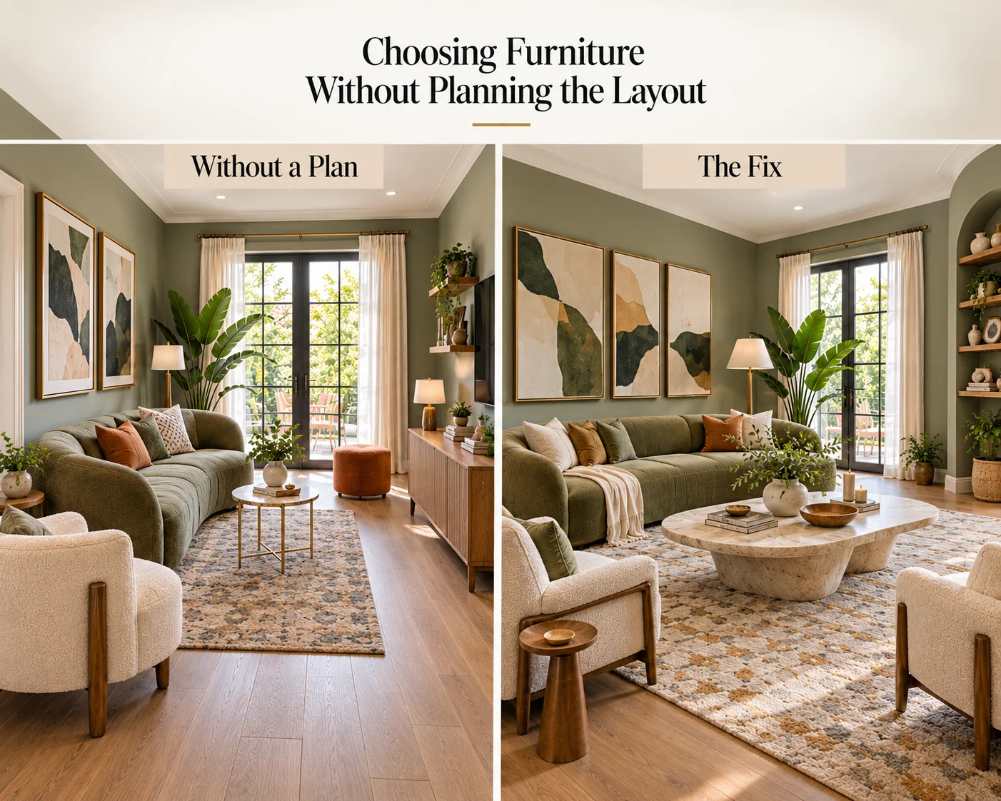
The Fix
Plan the main furniture arrangement before adding smaller pieces.
Start with the sofa and determine where people naturally enter and move through the room. Then establish the primary seating area before deciding where occasional chairs, side tables, lamps and storage should go.
Think about what the room actually needs to support. A living room designed mainly for conversation may require a different arrangement from one used primarily for television, reading or entertaining.
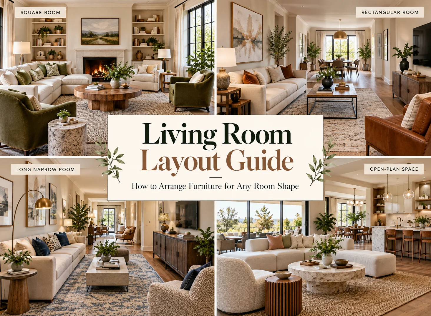
For a deeper look at furniture placement, circulation and conversation areas, read our living room layout guide.
2. Using Furniture That Is the Wrong Scale
Scale has an enormous effect on whether a living room feels complete.
A large sectional combined with tiny side tables and a delicate floor lamp can feel visually unbalanced. At the opposite extreme, several small pieces scattered around a large room can make the space feel temporary rather than intentionally furnished.
This does not mean every object should be similar in size. Variation creates interest. The pieces simply need enough visual weight to relate convincingly to one another.
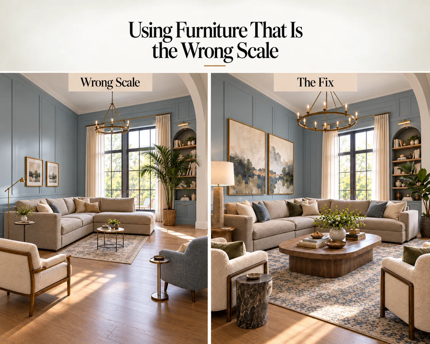
The Fix
Consider furniture as a composition rather than evaluating every piece independently.
A substantial sofa generally benefits from a coffee table, artwork, rug and lighting with enough scale to balance it. Smaller seating may work better with lighter tables and more compact accessories.
Before buying new furniture, mark its dimensions on the floor with painter’s tape. This gives you a much clearer sense of its footprint and the remaining circulation space.
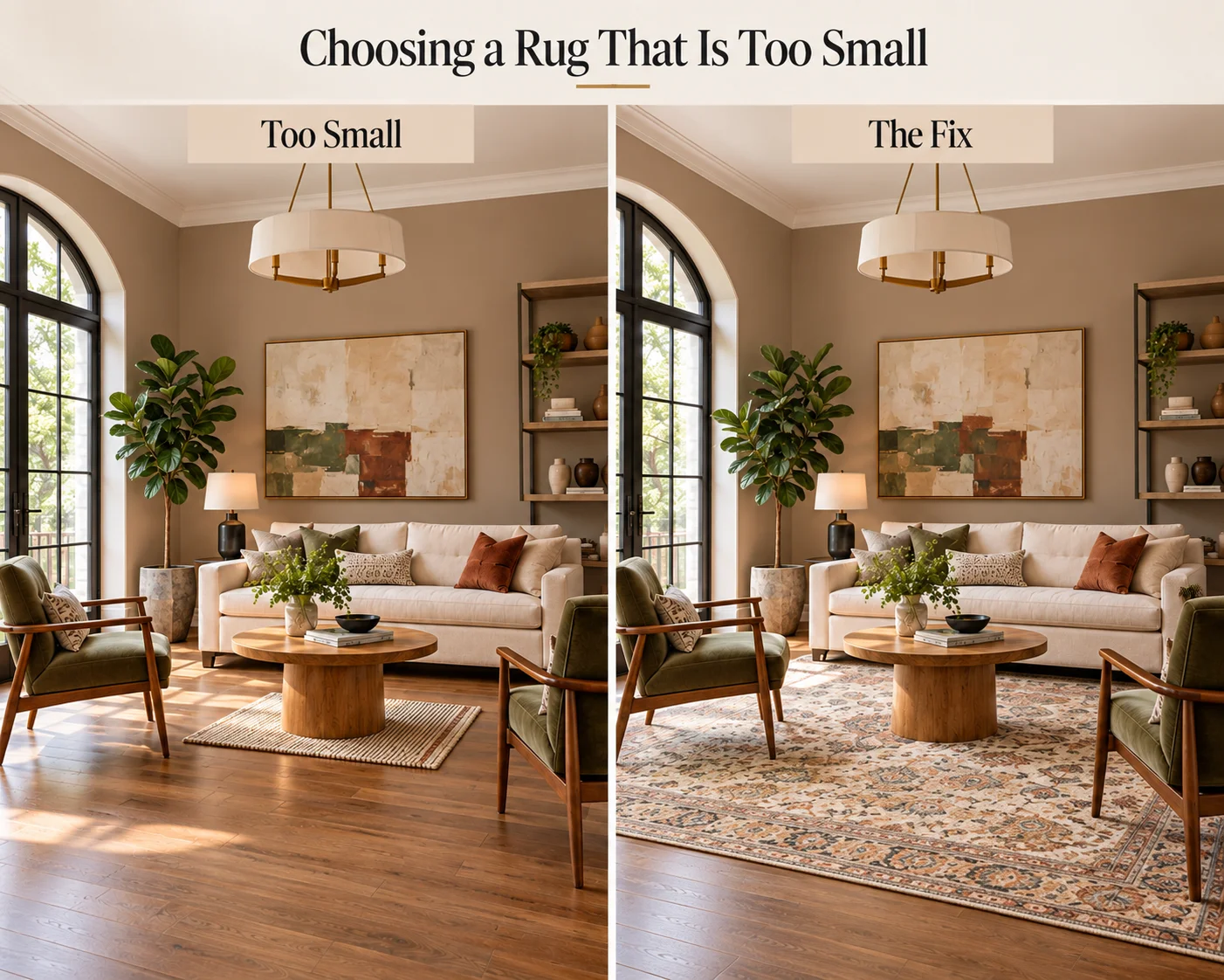
3. Choosing a Rug That Is Too Small
An undersized rug is one of the most noticeable living room decorating mistakes because the rug is responsible for visually connecting much of the seating area.
When a small rug sits alone beneath the coffee table without relating to the sofa or chairs, the furniture can appear to float around it.
Instead of creating one unified seating arrangement, the room becomes a collection of separate objects.
The Fix
Choose a rug large enough to visually anchor the primary furniture group.
In many living rooms, positioning at least the front legs of the sofa and surrounding chairs on the rug creates a much stronger relationship between the pieces. In a larger room, placing the entire seating group on the rug can create an even more defined zone.
Before purchasing, mark the proposed rug dimensions on the floor. The correct size is often larger than it appears when viewed online or folded in a store.
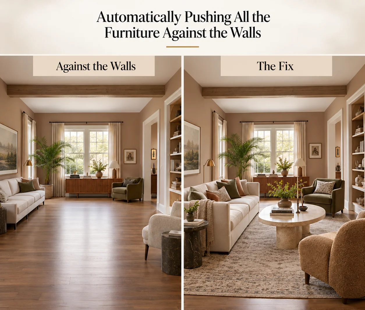
4. Automatically Pushing All the Furniture Against the Walls
Placing every piece of furniture around the perimeter can leave an empty area in the middle of the room while making the seating feel disconnected.
It can be particularly awkward in larger living rooms, where people may end up sitting too far apart for comfortable conversation.
Furniture does not automatically need to touch a wall simply because the wall is available.
The Fix
Arrange furniture according to the shape and function of the seating area rather than the boundaries of the room.
Where space allows, pull the sofa or chairs inward. Even a relatively small adjustment can make an arrangement feel more deliberate.
In larger spaces, floating furniture can also create useful circulation routes behind the seating area.
In a compact living room, however, placing a sofa against a wall may still be the most practical choice. The goal is not to follow a universal rule but to create an arrangement that works for the room.
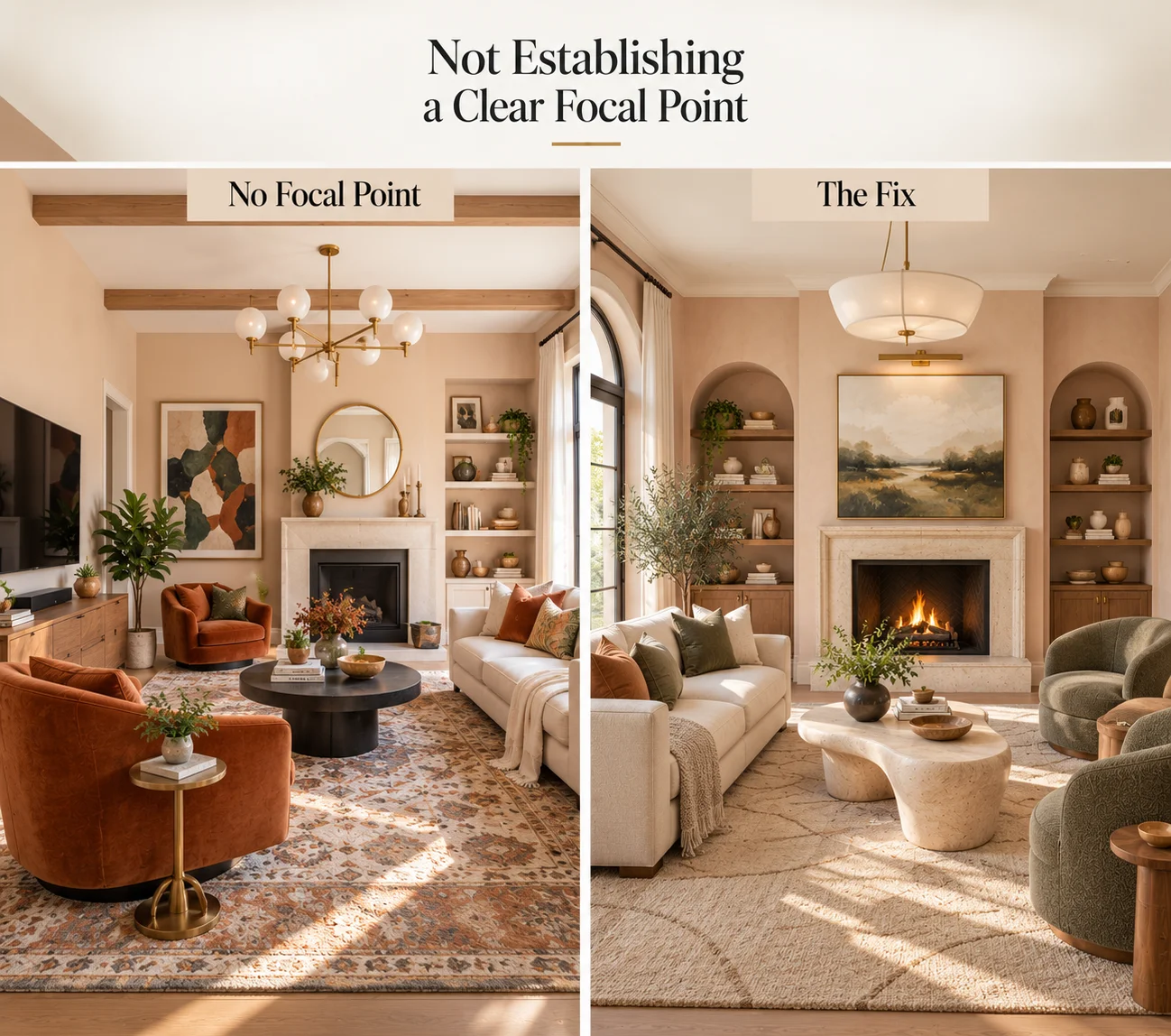
5. Not Establishing a Clear Focal Point
A living room can feel unfinished when the eye has nowhere obvious to settle.
This sometimes happens when several elements compete for attention: a television on one wall, dramatic artwork on another, a fireplace elsewhere and a bold feature chair in the corner.
The opposite problem can also occur. If every surface is quiet and every furnishing has similar visual weight, nothing anchors the composition.
The Fix
Decide what should command attention first.
A fireplace, large artwork, an architectural window, statement light fixture or media wall can all function as a focal point.
Then arrange surrounding elements to support rather than compete with it.
You can still have secondary points of interest, but creating a basic visual hierarchy makes the room easier to understand and usually gives it a much more polished appearance.
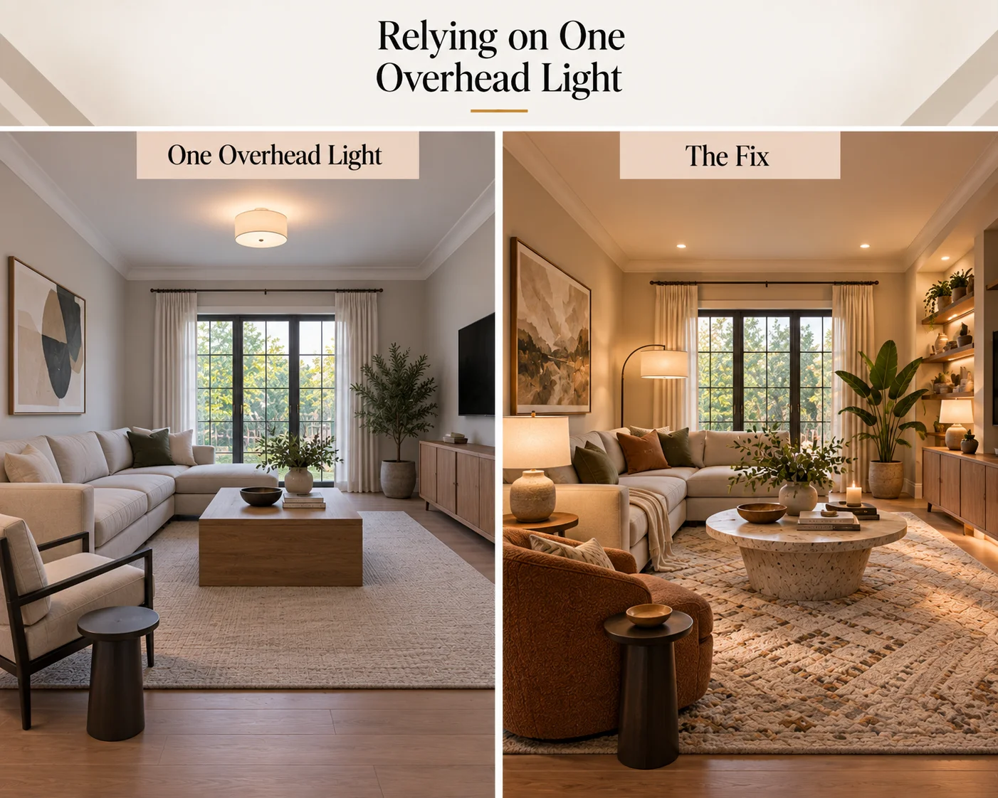
6. Relying on One Overhead Light
Even a beautifully furnished living room can feel flat when all of its illumination comes from a single ceiling fixture.
One overhead light may provide sufficient general illumination, but it rarely creates the depth and atmosphere associated with a thoughtfully designed interior.
It can also leave reading corners, shelves and other areas inadequately illuminated.
The Fix
Build the lighting in layers.
Start with ambient lighting, such as a ceiling fixture or recessed lights. Add task lighting where activities take place, perhaps with a floor lamp beside a reading chair or table lamp next to the sofa.
Finally, use accent lighting where appropriate to highlight artwork, shelving, architectural features or decorative objects.
The fixtures themselves also contribute to the design, so consider their height, material, shape and relationship with the surrounding furniture rather than treating lighting as purely functional.
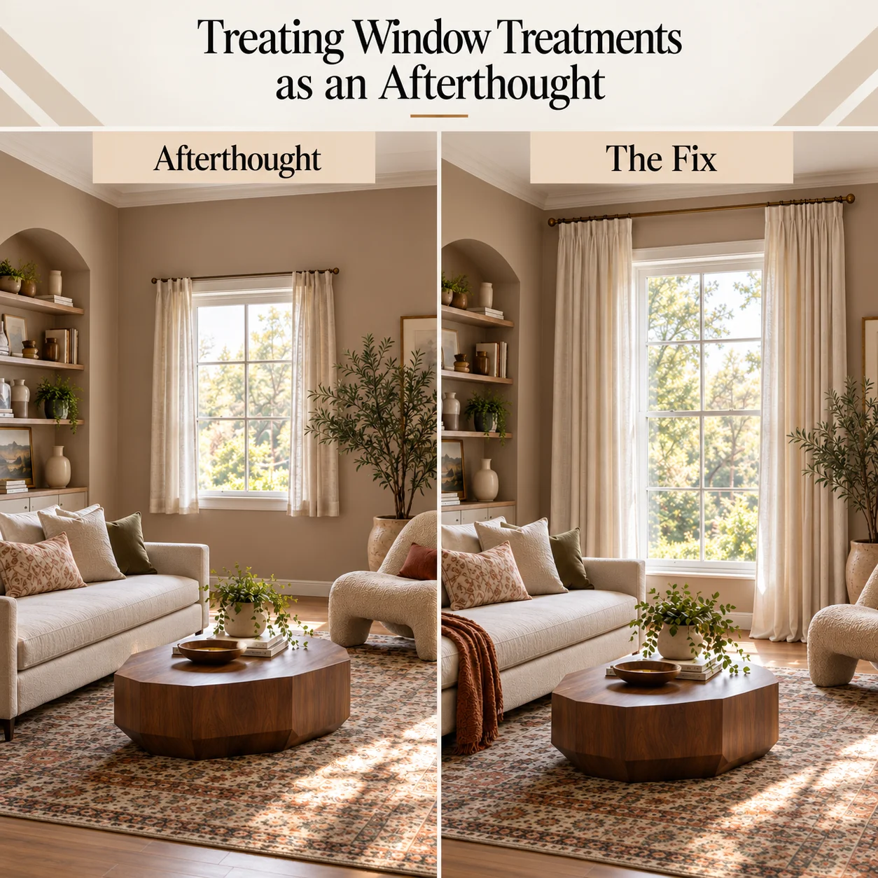
7. Treating Window Treatments as an Afterthought
Windows occupy a significant amount of visual space, yet curtains are often selected near the end of a project without considering proportion.
Panels that finish noticeably above the floor, barely extend beyond the window frame or appear too narrow when closed can make an otherwise finished room look incomplete.
The Fix
Treat curtains as part of the architecture of the room.
Where suitable, hanging the rod above the window and extending it beyond the sides of the frame can make the opening feel larger and allow more glass to remain visible when the curtains are open.
Choose enough fabric for the curtains to retain some fullness instead of becoming almost completely flat when drawn.
For most conventional full-length installations, the fabric should visually relate to the floor rather than stopping at an arbitrary point above it.
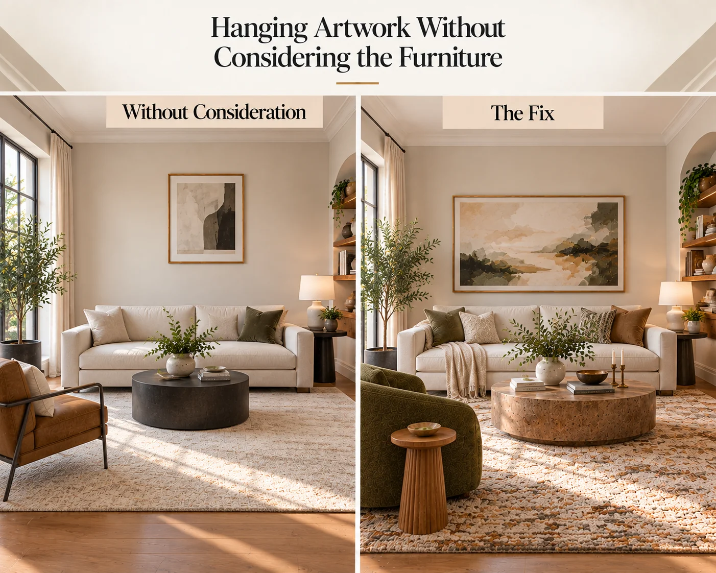
8. Hanging Artwork Without Considering the Furniture
Artwork frequently looks wrong not because the artwork itself is unsuitable but because its scale and position have little relationship with the furniture around it.
A small picture floating high above a wide sofa, for example, can leave a large area of disconnected wall between the two.
Similarly, spreading several small frames too far apart can make them appear like unrelated objects rather than one composition.
The Fix
Think of artwork and the furniture beneath it as a visual group.
Over a sofa or console, choose either one sufficiently substantial piece or arrange several smaller works so they read as a cohesive collection.
A gallery wall should also have a clear overall boundary. Consistent spacing between pieces helps different frames and artworks feel intentionally connected.
Before making holes in the wall, test the composition using paper templates or arrange the pieces on the floor first.
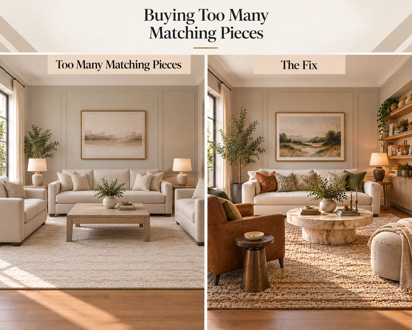
9. Buying Too Many Matching Pieces
Matching furniture can simplify shopping, but using the same collection for the sofa, chairs, tables and storage can sometimes make a living room resemble a showroom display.
The room may technically coordinate while still lacking the variation that makes an interior feel collected and personal.
The Fix
Aim for coordination rather than exact matching.
You might combine a clean-lined sofa with a more sculptural chair, a timber coffee table and metal or stone side tables. They do not have to come from the same range to feel connected.
Look for subtler relationships instead: similar timber undertones, repeated shapes, complementary materials or colors that appear elsewhere in the room.
This approach is especially useful in styles that intentionally balance simplicity with individuality, such as a Japandi living room or Scandinavian living room.
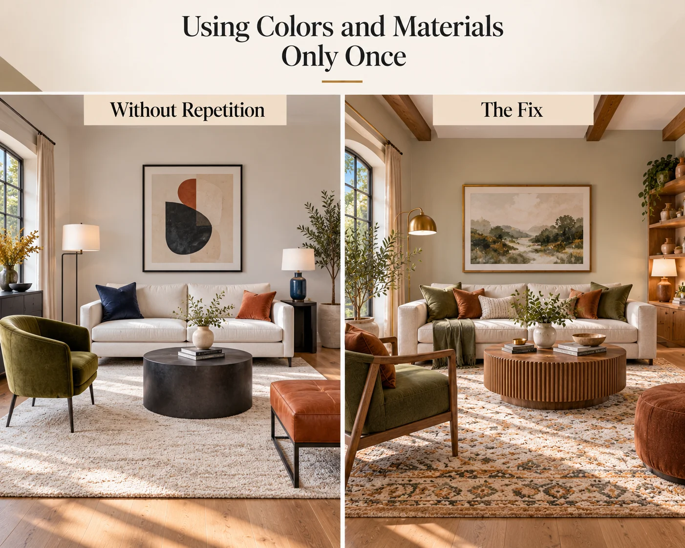
10. Using Colors and Materials Only Once
A striking cushion, green chair or brass lamp can look surprisingly disconnected when nothing else in the living room relates to it.
Cohesion does not require everything to match, but it usually benefits from repetition.
When colors, materials or shapes recur in several places, the eye begins to connect otherwise different objects.
The Fix
Repeat a small number of visual elements throughout the room.
If an accent chair introduces olive green, you might echo that color subtly in artwork, a cushion or a decorative object. Walnut used for the coffee table might reappear in a picture frame or side table. A curved lamp could relate to a rounded chair or circular table.
The repetitions do not have to be exact.
This principle is particularly useful in expressive interiors. A successful bohemian living room, for example, can contain many different objects while remaining cohesive because colors, materials and textures quietly repeat across the space.
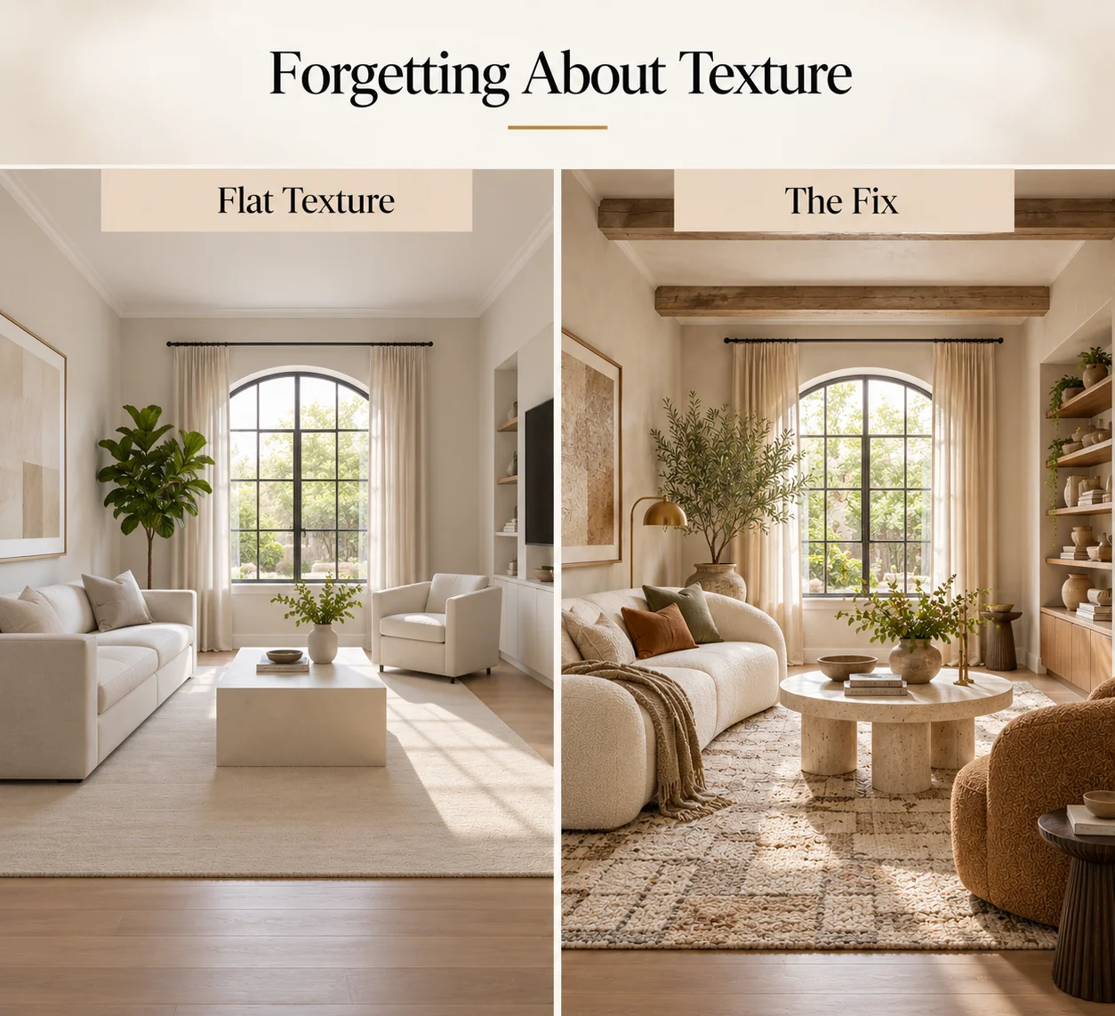
11. Forgetting About Texture
A living room can have the right furniture, colors and layout yet still feel visually flat if most surfaces have a similar finish.
This is particularly noticeable in neutral rooms. Smooth painted walls, plain upholstery, polished tables and hard flooring may create a clean foundation, but without enough tactile contrast the space can look as though another layer is missing.
The Fix
Introduce a controlled mixture of textures.
Combine materials such as linen, wool, timber, stone, boucle, leather, rattan, ceramic and brushed metal according to the style of the room.
You do not need every texture at once. A wool rug, linen curtains, timber table and ceramic lamp may already provide enough contrast to make a simple space feel considerably richer.
Texture is especially useful when working with restrained interiors because it creates depth without requiring additional color or decorative clutter. Our guide to creating a minimalist living room explores how to achieve that balance while keeping the space visually calm.
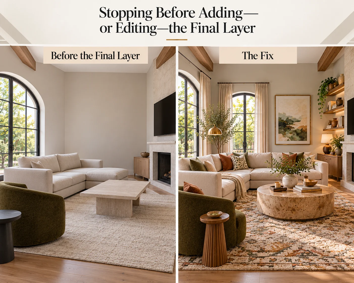
12. Stopping Before Adding—or Editing—the Final Layer
The difference between a furnished living room and a finished living room often appears in the final layer.
A sofa, rug, coffee table and television may make the room functional, but the arrangement can still feel impersonal if there is no artwork, lighting variation, greenery, books or meaningful decoration.
The reverse can be equally problematic. Adding accessories to every table, shelf and wall can obscure the stronger elements of the design.
The Fix
Add decorative elements selectively, then edit.
Look for areas that genuinely feel incomplete. Perhaps a blank wall needs artwork, an empty corner needs a floor lamp or plant, or the coffee table needs one simple group of objects.
Then consider the negative space around those additions.
Not every wall requires artwork. Not every corner needs furniture. Not every surface needs styling.
If you prefer a restrained aesthetic, review these minimalist decorating mistakes before assuming that minimalism means removing every decorative or tactile element. If you prefer more collected interiors, our guide to boho design principles explains how layering and variety can still feel intentional.
How Do You Make a Living Room Look More Finished?
If your living room currently feels incomplete, resist the urge to immediately buy more decor.
First look at the larger relationships in the room.
Check whether the furniture forms a clear seating area. Make sure the rug is large enough to connect that furniture. Identify the main focal point. Review the scale and placement of artwork. Add lighting at several heights, and look for colors or materials that could be repeated elsewhere.
Only then consider additional accessories.
In many cases, rearranging what you already own will make a bigger difference than purchasing several new decorative pieces.
A Simple Living Room Finishing Checklist
- Define what the living room needs to do.
- Arrange the main furniture before adding smaller pieces.
- Check that furniture is appropriately scaled for the room and for one another.
- Use a rug large enough to anchor the seating area.
- Create comfortable circulation routes.
- Establish a clear primary focal point.
- Layer ambient, task and accent lighting.
- Choose window treatments that suit the proportions of the windows.
- Relate artwork to the furniture and architecture around it.
- Repeat several colors, materials or shapes throughout the space.
- Introduce enough texture to create visual depth.
- Add personal details selectively and preserve some empty space.
Frequently Asked Questions
Why does my living room look unfinished?
A living room often looks unfinished because the main elements do not yet feel visually connected. Common causes include an undersized rug, artwork that is too small for the wall, poor furniture placement, insufficient lighting, a lack of texture or colors and materials that are not repeated elsewhere in the room.
What makes a living room look professionally designed?
Professionally designed living rooms usually show clear relationships between scale, furniture placement, lighting, color and materials. Rather than relying on a large quantity of decoration, they tend to have a defined layout, visual hierarchy, repetition and enough variation in texture and shape to create depth.
What should I fix first in an unfinished living room?
Start with the layout. Moving furniture costs nothing and can immediately reveal whether the seating arrangement, focal point and circulation are working properly. Next review the rug size and lighting, because both affect how the entire furniture group is perceived. Accessories and finishing details should generally come later.
Does every living room need a rug?
No. A rug is not essential in every living room, particularly when the flooring itself is a strong design feature. However, rugs are useful for defining seating areas, introducing texture and visually connecting furniture, especially in open-plan spaces.
How can I make my living room look finished without buying new furniture?
Rearrange the furniture, improve the lighting, reposition artwork, edit accessories and repeat existing colors or materials in several places. You can also move decorative objects between rooms rather than purchasing new ones. Small changes to proportion and placement often have a greater effect than simply adding more items.
Final Thoughts
A finished living room is not necessarily a room filled with more things.
It is a room in which the individual elements appear to belong together.
The furniture relates to the size of the space. The rug connects the seating. Lighting works at several levels. Artwork relates to the surfaces beneath it. Colors, materials and shapes repeat just enough to create continuity, while empty space allows the important pieces to remain visible.
If something still feels wrong in your living room, examine these relationships before reaching for another accessory.
Correcting one or two fundamental design mistakes may be all that is needed to transform a room that feels almost finished into one that feels considered, comfortable and complete.